At first I found this tutorial relatively easy as long as I kept things organized and neat. However, I kept getting errors about the nodes which caused Maya to crash constantly. This made it difficult to do this tutorial and it took a lot longer than it originally would have. That said, I've finished it and put it into a Scribd document to make the images more organized.

Wednesday, 30 September 2015
Tuesday, 29 September 2015
Space Oddities: Metropolis
Inspiring various genres such as science fiction, disaster, romance and possibly even horror and spy films, Fritz Lang's "Metropolis" (1927) continues to enchant viewers. With its now obsolete but still enchanting special effects, exaggerated acting, masses of extras, and engaging story, this film has remained an impactful piece of cinematography.
Metropolis avoids categorization into a specific genre. It combines elements from romance, science fiction, some elements of horror and it even introduces disaster scenarios in film. "The climactic scenes in which Fredersen's son Freder (Gustav Frolich) saves crowds of children from floods having a rousing blockbuster intensity, setting a template for the disaster movie," (Romney, 2010). Once Metropolis introduced this, many films followed suit seeing how effectively it created suspense or even anxiety in the viewer.
It is impressive to imagine how in 1927, filmmakers were able to create such disaster scenes. Even the creation of the city and the illusion of it bustling with people is mind boggling considering the time the film was made. The detailed miniatures and use techniques such as using reflections from mirrors to create the buzzing city remain striking all of these years later. It's incredibly refreshing to see actual people on real sets versus computer generated people and objects. "Because they looked strange and unworldly compared to the slick, utterly convincing effects that are now possible, they were more evocative," (Ebert, 1998). Sometimes it's nice to see real physical people moving or real objects crumbling into pieces, even if it's not as realistic to what special effects can achieve today.
Metropolis also accurately captures realistic human beings who are flawed, make mistakes, and sometimes have a large ego (often without realizing). In this film, various emotions and actions that are considered undesirable are expressed These include jealousy, anger, selfishness, inability to forgive, and so on. We see people mindlessly following a manipulative leader and getting a high off of the destruction they cause, sending them into a frenzy.
This creates an ability to relate to various characters, their emotions, and their actions within the film. Some examples include getting caught in the moment (when the mob started destroying machines), grudges (when Rotwang refuses to let go of Hel and orders his robot to destroy Fredersen's city and Freder), and even little details such as "the workers' subsequent malaise is likely something to which commuters can all too easily relate," (Abrams, 2010). This makes the film more engaging since the audience can easily relate and connect with various characters and their actions.
The story of Metropolis will keep the viewer at the edge of their seat but avoids becoming too hectic by introducing slower paced scenes (admittedly too slow at times) such as intimate moments between Maria and Freder. However, some may believe that this makes Metropolis feel messy and difficult to follow. Many think that the gaps and the sometimes bizarre, patchy plot is so incoherent that it ruins the film . This is unfortunate as the film itself was edited poorly and parts of the original film are still missing. The missing chunks of the film continue to be found over time although they are sometimes too damaged to use. Overall, Metropolis remains a visually pleasing film with a fascinating plot and relatable characters despite some inconsistency in the film itself.
Bibliography:
Abrams, S. (2010) Metropolis At: http://www.slantmagazine.com/film/review/metropolis Accessed on: 29/09/2015
Ebert, R. (1998) Metropolis At: http://www.rogerebert.com/reviews/great-movie-metropolis-1927 Accessed on : 29/09/2015
Romney, J (2010) Metropolis At: http://www.independent.co.uk/arts-entertainment/films/reviews/metropolis-fritz-lang-145-mins-pg-5851451.html Accessed on: 29/09/2015
Illustration List:
Figure 1. Metropolis (1927) [Poster] At: http://images.posterjunction.com/Metropolis-movie-poster-1020352735.jpg Accessed on: 29/09/2015
Figure 2. [Screenshot] At: http://i.ytimg.com/vi/QE2y89ShUIE/maxresdefault.jpg Accessed on: 29/09/2015
Figure 3. [Screenshot] At: http://cdn.bloody-disgusting.com/wp-content/uploads/2012/08/maria1.jpg Accessed on: 29/09/2015
 |
| Fig. 1 Metropolis (1927) |
Metropolis avoids categorization into a specific genre. It combines elements from romance, science fiction, some elements of horror and it even introduces disaster scenarios in film. "The climactic scenes in which Fredersen's son Freder (Gustav Frolich) saves crowds of children from floods having a rousing blockbuster intensity, setting a template for the disaster movie," (Romney, 2010). Once Metropolis introduced this, many films followed suit seeing how effectively it created suspense or even anxiety in the viewer.
It is impressive to imagine how in 1927, filmmakers were able to create such disaster scenes. Even the creation of the city and the illusion of it bustling with people is mind boggling considering the time the film was made. The detailed miniatures and use techniques such as using reflections from mirrors to create the buzzing city remain striking all of these years later. It's incredibly refreshing to see actual people on real sets versus computer generated people and objects. "Because they looked strange and unworldly compared to the slick, utterly convincing effects that are now possible, they were more evocative," (Ebert, 1998). Sometimes it's nice to see real physical people moving or real objects crumbling into pieces, even if it's not as realistic to what special effects can achieve today.
 |
| Fig. 2 |
Metropolis also accurately captures realistic human beings who are flawed, make mistakes, and sometimes have a large ego (often without realizing). In this film, various emotions and actions that are considered undesirable are expressed These include jealousy, anger, selfishness, inability to forgive, and so on. We see people mindlessly following a manipulative leader and getting a high off of the destruction they cause, sending them into a frenzy.
This creates an ability to relate to various characters, their emotions, and their actions within the film. Some examples include getting caught in the moment (when the mob started destroying machines), grudges (when Rotwang refuses to let go of Hel and orders his robot to destroy Fredersen's city and Freder), and even little details such as "the workers' subsequent malaise is likely something to which commuters can all too easily relate," (Abrams, 2010). This makes the film more engaging since the audience can easily relate and connect with various characters and their actions.
 |
| Fig. 3 |
The story of Metropolis will keep the viewer at the edge of their seat but avoids becoming too hectic by introducing slower paced scenes (admittedly too slow at times) such as intimate moments between Maria and Freder. However, some may believe that this makes Metropolis feel messy and difficult to follow. Many think that the gaps and the sometimes bizarre, patchy plot is so incoherent that it ruins the film . This is unfortunate as the film itself was edited poorly and parts of the original film are still missing. The missing chunks of the film continue to be found over time although they are sometimes too damaged to use. Overall, Metropolis remains a visually pleasing film with a fascinating plot and relatable characters despite some inconsistency in the film itself.
Bibliography:
Abrams, S. (2010) Metropolis At: http://www.slantmagazine.com/film/review/metropolis Accessed on: 29/09/2015
Ebert, R. (1998) Metropolis At: http://www.rogerebert.com/reviews/great-movie-metropolis-1927 Accessed on : 29/09/2015
Romney, J (2010) Metropolis At: http://www.independent.co.uk/arts-entertainment/films/reviews/metropolis-fritz-lang-145-mins-pg-5851451.html Accessed on: 29/09/2015
Illustration List:
Figure 1. Metropolis (1927) [Poster] At: http://images.posterjunction.com/Metropolis-movie-poster-1020352735.jpg Accessed on: 29/09/2015
Figure 2. [Screenshot] At: http://i.ytimg.com/vi/QE2y89ShUIE/maxresdefault.jpg Accessed on: 29/09/2015
Figure 3. [Screenshot] At: http://cdn.bloody-disgusting.com/wp-content/uploads/2012/08/maria1.jpg Accessed on: 29/09/2015
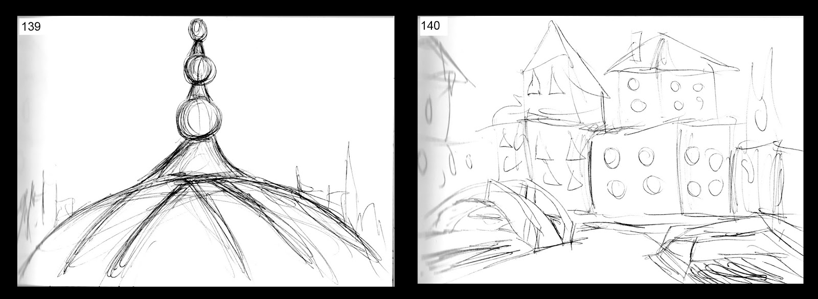
Invisible Cities: Thumbnails #127-140
I tried out thumbnails of a few other cities I haven't explored much. Please excuse the blurred left side of the images, that is because of how the pages curve into the spine...it makes the scanned image look a little fuzzy.
 |
| Ersilia (top) and Esmeralda (bottom) |
 |
| Moriana (top) and Thekla (bottom) |
 |
| Anastasia (top) and Diomira (bottom) |
 |
| Phyllis |
Invisible Cities: Thumbnails #113-126
After yesterdays Photoshop class I decided to experiment with making thumbnails in a similar way to the abstract pieces we made. Again I focused on Argia since I really like that city and I love thinking of ideas for it. This time I made the buildings more oddly shaped/deformed, I intended to make them look sort of like screaming faces. I also expanded a bit on my glow worm idea, I really love how these turned out for the most part and I might add in some colour adjustments later on to see how that works. I also will probably still do more drawings of other cities since a couple I only have a thumbnail or two for and I'm paranoid that I need more than just one.


Monday, 28 September 2015
Autodesk Maya Lesson: Ray Gun Version 2
Since I'm ahead of the tutorials, I already made a ray gun so I made this one slightly different. I listened to the next video for the Maya tutorials with the alien eyeballs "Intro to Maya: Materials & Textures in 3D Software" but it said lecture only so I'm assuming for that one I don't need to post anything (if I'm wrong please correct me!). I'm looking forward to trying out the next tutorial about common shaders although it seems intimidating.


Digital Painting: Master Studies and Abstracts
I really enjoyed todays digital painting class although with pieces like this I tend to zoom in too much. However, today I refused to zoom in too far so they are not as refined as I normally like... but I think they're decent anyway. I wasn't so sure about the idea of abstract pieces but I ended up liking that too and used tools such as the lasso tool which I usually avoid. I'll definitely consider making some abstract pieces for my Invisible Cities thumbnails, I think it might really help with variation, inspiration, and motivation to keep making more.


Sunday, 27 September 2015
Invisible Cities: Thumbnails #99-112
I decided to do something a little different with my thumbnails this time. I wanted to draw my line art first then do my shading but instead of making the line art transparent, I left it visible. Thumbnails #99-108 is Octavia while #109-112 is Fedora.
 |
| Octavia (all) |
 |
| Octavia (106-108) and Fedora (109-112) |
Friday, 25 September 2015
Invisible Cities: Thumbnails #85-98
I had a lot of ideas for the city of Argia. I decided to experiment with different types of architecture inspired by graves I took photos of from Pére Lachaise Cemetery, photos I took in Venice and also some photos I found online of Cappadocia. I was also considering what lighting this city would have so I looked at cenotes in Mexico where sunlight or moonlight might be able to shine onto the city. I also remembered something about 'glow worms' when I watched Planet Earth a while ago and thought it'd be an interesting idea.
I think glow worms could work well with the unsettling atmosphere of this city as it would add a of damp, gross feeling (they secrete mucus beads/strands to catch pray using bioluminescence). They also glow blue which would keep the gloomy mood. If I imagine the inhabitants, I can picture them farming the glow worms (similar to silk worm farming maybe) then sticking them on walls for valuable light.


I think glow worms could work well with the unsettling atmosphere of this city as it would add a of damp, gross feeling (they secrete mucus beads/strands to catch pray using bioluminescence). They also glow blue which would keep the gloomy mood. If I imagine the inhabitants, I can picture them farming the glow worms (similar to silk worm farming maybe) then sticking them on walls for valuable light.


Intro to Autodesk Maya: Block Modeling
I really enjoyed this tutorial and found it slightly less difficult than the previous one. I nearly lost all progress I made on it when I finished making the decorations for the handle because my files got all messed up. Luckily I just backed up everything on my external HD that morning so I only had to redo the spheres on the side, the handle, trigger and the spheres on the handle instead of the whole thing. Before that I didn't back anything up for a while so from now on I'm definitely going to make sure I back things up regularly.


Thursday, 24 September 2015


Wednesday, 23 September 2015
Invisible Cities: Thumbnails #55-64
I really liked making this group of thumbnails. Although I think Argia is somewhat hard to imagine, it really appealed to me and painted some strong pictures in my mind while I read it. So far I think this city appeals to me the most.


Tuesday, 22 September 2015
Invisible Cities: Thumbnails #31-48
I've done a few pages of traditional thumbnails using pen. I think I like #31 but it's sort of hard to see what's going on. I also quite like #40, #42, #47, and #48...feedback always welcome.


Space Oddities: Das Cabinet des Dr. Caligari
A clear example of German Expressionism, Robert Weine's "Das Cabinet des Dr. Caligari" (1920) set itself apart from other films of this time. By exploring the fragmentation, distortion and deterioration of reality, it makes you wonder if your own mind can be trusted. Caligari is the first piece of cinematography to truly delve into the horror genre.
Some people may be put off by the lack of colour or sound but the set design, makeup, exaggerated theoretical acting and lighting allows to the film to remain a classic to this day. "The whole atmosphere is of a world gone wrong; like a dream worthy of Salvador Dalí. Nothing is square or straight. The buildings loom in on you; windows sweep upward, slanted or curved; doors are obscenely angled holes beckoning you to enter and be trapped inside," (Eaton, 2002). Although the sets are definitely unrealistic, it extends the intent of creating a surreal and uneasy environment. It causes discomfort, there never appears to be anywhere for the characters to escape since everything feels sharp and claustrophobic.
The set design further enhances the idea of psychological illness and insanity. Although it may not be obvious at first, but this jagged landscape reflects the mindset of our main character, Francis (Freidrich Feher) as he attempts to capture Dr. Caligari (Werner Krauss) who uses Cesare (Conrad Veidt), a somnambulist to commit crimes. These crimes include the murder of Francis' friend Alan (Hans Heinrich) and the abduction of Jane (Lil Dagover).
However, it is later discovered Francis' story about Caligari is in fact nothing but a fragment of his imagination, using people in the asylum as characters in his story. "'Caligari' creates a mindscape, a subjective psychological fantasy. In this world, unspeakable horror becomes possible," (Ebert, 2009). This inability to distinguish between reality and imagination is perhaps why The Cabinet of Caligari is considered to be the first true horror film.
"The film has been described not just as one of the first 'horror' films, but one of the first examples of a movie generating a real psychological uneasiness in its audience," (Stend, 2014). Even now the idea of insanity and psychological illness makes people feel uneasy, perhaps because it is misunderstood. During the time of the film's original release, Caligari was probably even more unsettling than to people now. This is due to the fact that only recently has mental illnesses truly been brought to the public eye in an attempt to understand and accept it.
Weine skillfully uses sharp architecture, high contrast lighting and various other elements mentioned above to make the viewer believe what they are seeing at first, but later coming to the realization it was all an illusion. Making people question themselves and what they think is reality makes The Cabinet of Caligari a classic film that still inspires horror films to this day.
Bibliography:
Eaton, T. (2002) Discovering Silent Film At: http://www.imdb.com/title/tt0010323/reviews (Accessed on 22/02/2015)
Ebert, R (2009) The Cabinet of Dr. Caligari At: http://www.rogerebert.com/reviews/great-movie-the-cabinet-of-dr-caligari-1920 (Accessed on 22/09/2015)
Stend, S. (2014) Das Cabinet des Dr Caligari - review At: http://silentlondon.co.uk/2014/06/24/das-cabinet-des-dr-caligari-review/ (Accessed on 22/9/2015)
Illustration List:
Figure 1. Das Cabinet des Dr. Caligari (1920) [Poster] At: http://www.rogerebert.com/reviews/great-movie-the-cabinet-of-dr-caligari-1920 (Accessed on 22/09/2015)
Figure 2. [Screenshot] At: https://vintagemoviereviews.files.wordpress.com/2015/01/caligari.jpg (Accessed on 22/09/2015)
Figure 3. [Screenshot] At: https://axlrosstumanut.files.wordpress.com/2013/02/vlcsnap-2013-02-24-17h29m23s202.png (Accessed on 22/09/2015)
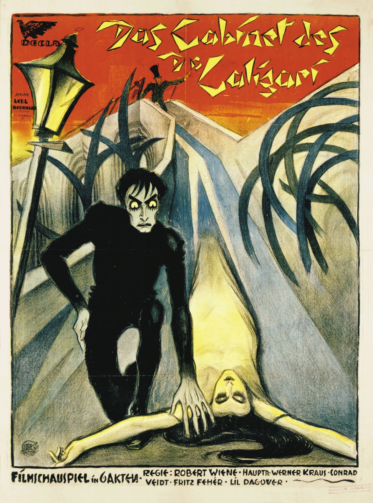 |
| Fig. 1 Das Cabinet des Dr. Caligari (1920) |
 |
| Fig. 2 |
However, it is later discovered Francis' story about Caligari is in fact nothing but a fragment of his imagination, using people in the asylum as characters in his story. "'Caligari' creates a mindscape, a subjective psychological fantasy. In this world, unspeakable horror becomes possible," (Ebert, 2009). This inability to distinguish between reality and imagination is perhaps why The Cabinet of Caligari is considered to be the first true horror film.
 |
| Fig. 3 |
Weine skillfully uses sharp architecture, high contrast lighting and various other elements mentioned above to make the viewer believe what they are seeing at first, but later coming to the realization it was all an illusion. Making people question themselves and what they think is reality makes The Cabinet of Caligari a classic film that still inspires horror films to this day.
Bibliography:
Eaton, T. (2002) Discovering Silent Film At: http://www.imdb.com/title/tt0010323/reviews (Accessed on 22/02/2015)
Ebert, R (2009) The Cabinet of Dr. Caligari At: http://www.rogerebert.com/reviews/great-movie-the-cabinet-of-dr-caligari-1920 (Accessed on 22/09/2015)
Stend, S. (2014) Das Cabinet des Dr Caligari - review At: http://silentlondon.co.uk/2014/06/24/das-cabinet-des-dr-caligari-review/ (Accessed on 22/9/2015)
Illustration List:
Figure 1. Das Cabinet des Dr. Caligari (1920) [Poster] At: http://www.rogerebert.com/reviews/great-movie-the-cabinet-of-dr-caligari-1920 (Accessed on 22/09/2015)
Figure 2. [Screenshot] At: https://vintagemoviereviews.files.wordpress.com/2015/01/caligari.jpg (Accessed on 22/09/2015)
Figure 3. [Screenshot] At: https://axlrosstumanut.files.wordpress.com/2013/02/vlcsnap-2013-02-24-17h29m23s202.png (Accessed on 22/09/2015)
Invisible Cities: Thumbnails #21-30
I've decided to start doing multiple thumbnails focusing on a single city. I started off with Leonia.


Intro to Autodesk Maya: Modeling in 3D Software
After some frustration I managed to make the egg cups in the first Maya tutorial. I struggled a bit with the Polygon model but I realized what I was doing wrong and was able to fix it. I wasn't sure how I was mean to present the finished egg cups so I took a screenshot (if I clicked on render view the SubD version would look just like the Polygon version). So if there is anything I need to change, feel free to let me know.


Monday, 21 September 2015
Digital Painting Class: Pears and Apples
I enjoyed the exercises we did in our first digital painting class, although I found it strange not using my regular set of brushes (next time I'm planning on using my own). On top of that I tried a different method to how I usually digitally paint.

 I usually draw line art first then block in darker colours, later on adding highlights. This time I tried blocking in the shapes first instead since I know this works for some people but I'm not sure it's right for me. Despite this, I think them came out reasonably well...it's good to try out different techniques anyway.


Sunday, 20 September 2015
Invisible Cities: Thumbnails #11-20
I made a couple more thumbnail sketches today, only this time I drew them digitally. I didn't do shading and I avoided colour this time just so I didn't spend too much time adding detail yet.


I'm not a big fan of #11 and #14 but I quite like how #16, #17, and #18 turned out. Some cities are definitely easier for me to imagine compared to others.
Invisible Cities: Influence Map #2
I've put together a second influence map for the Invisible Cities project. I tried to take the advice people left me and use more real structures/real life objects/abstract images in this second map. I've also used a few photos I've taken myself again.


Perspective Exercises #1
Here are some of the perspective exercises I've done so far. Since perspective isn't my strongpoint, I'll probably practice and post a few more.


Saturday, 19 September 2015
Invisible Cities: Influence Map #1
I've started putting together some influence maps for the Invisible Cities project. I was unsure if each city needed to have a separate map or if we just needed to do a few maps of images relating to all the different cities. I decided to make a map including some ideas relating to various cities that I feel more drawn to so far. I'm looking forward to making a few more maps, it really helps me to get ideas flowing.


Thursday, 17 September 2015
Invisible Cities: Thumbnails #1-10
I've been reading/highlighting/taking notes about some of the Invisible Cities for our first project. I'm probably way ahead of myself but I decided to do some really tiny doodles for a few of the cities. There were a few I didn't sketch that I also stood out to me such as Armilla and Ersilia, but here are the one's I've made. They are only doodles but I figured it'd be a good thing to share.


Wednesday, 16 September 2015
Personal Work: The Ground Walks, With Time In A Box
I recently downloaded all of the software needed for CAA so I decided to do a quick digital painting using Photoshop CC instead of Photoshop CS5 which I usually use. I enjoyed playing with the different settings on my new graphics tablet, although the different surface size will take a little getting used to. Some of the buttons like the wheel I found really sped up my workflow.


I chose to draw a scene from a Modest Mouse music video (The Ground Walks, With Time In A Box) because my sister has always loved that band so it reminded me of her and I found the video odd and entertaining. I had a lot of fun making this and I'm very happy with it came out. Also, now I get more practice with adding videos to Blogger instead of hyperlinks.
Adding Video/Scribd Presentation Practice Post
After our Blogger FAQ's today, I decided to go along with what Phil suggested and practice embedding a video and making/embedding a Scribd presentation to my Blogger. I am slightly worried that my blog might too much of a 'theme' which was mentioned today. If anyone who reads this could leave a comment letting me know what they think I'd appreciate it. If my blog seems to have too strong of a theme I'll redesign it. The current design has to do with my sister's artwork so to me it isn't a specific theme but I know other people might see it differently.
I also liked how my Scribd presentation turned out of my Summer Project. I admit I could have rearranged the thumbnails in a better way but since this is just a practice post I didn't want to drive myself mad with making it perfect.
I'm very excited to start our first project on Monday, I've begun reading about the 'Invisible Cities' and a lot of them sound very interesting. I'm looking forward to learning more about the project on Friday and getting some advice from people who are on this course/have graduated.
Anyway, I found this animation 'Vagabond' a few months ago and really enjoyed it so I chose to share it since 'Steadyfast Stanley' was already posted on the main CAA blog.
I also liked how my Scribd presentation turned out of my Summer Project. I admit I could have rearranged the thumbnails in a better way but since this is just a practice post I didn't want to drive myself mad with making it perfect.
I'm very excited to start our first project on Monday, I've begun reading about the 'Invisible Cities' and a lot of them sound very interesting. I'm looking forward to learning more about the project on Friday and getting some advice from people who are on this course/have graduated.
Thursday, 10 September 2015
Personal Work: Bubba
Since I finished my summer project I decided I wanted to do some drawing. I decided to return to a sketch of my dog, Butters (or 'Bubba'), I started earlier in the summer. I used a photo I took of her while I was visiting my family in America. I miss her a lot, and she's starting to get old now so I felt like I wanted to do this without colours. I enjoyed making it, although it made me miss her more...it's always horrible leaving her behind when I come back home. At least with humans you can explain to them why you're leaving and they'll understand.


It's not the best drawing I've ever made, but I like it anyway.
Thursday, 3 September 2015
Life Form Turnaround: Hellhound
Finally I've had time to finish my final turnaround design. I would've liked to have done this sooner, however I've been focused on moving stuff into my new flat, getting IKEA furniture built, and deep cleaning everything. The amount of spiders I have seen/killed (from a great distance using a bug killing spray) and the amount of grime I've cleaned away will haunt my dreams for weeks to come. In between looking after my mother's giant Boerboel puppy, I've found enough time in the last two days to finish my life form design. I was between thumbnails #64 and #92 and after looking through reference photos and other artists work, I decided to go with #64.


I wasn't sure what I was going to do with it, I was debating about making it more of a sort of plant-creature with thorns or making it a sort of Resident Evil inspired zombie dog. However, after trying out several different colour schemes, I went with a Hellhound idea. I really struggled with the front view, I always have a hard time drawing dogs head-on because of the foreshortening of the snout. I also had a bit of a hard time with the legs and paws, but I think I did a reasonable job with it. I tried to make the skin look leathery instead of furry since it gave me the opportunity to define the muscles underneath to make it look more menacing.
The life form was the one I was most excited to draw, but I also found it the most difficult one to refine. Overall, like my other two turnarounds, I'm happy with the final result.


The life form was the one I was most excited to draw, but I also found it the most difficult one to refine. Overall, like my other two turnarounds, I'm happy with the final result.
Subscribe to:
Posts (Atom)