

Tuesday, 31 January 2017
Adaptation A: Shovel Thumbnails
Today I made a variety of shovels so I could see what sort of shapes I liked and what different handles I could have. I think my favourites are #16 and #18 but I also like the handle on #17 so I may combine them.

Autodesk Mudbox: Extracting Normal Maps
Today in our lesson we were given freedom to do some more playing around and sculpting using the meshes that were available to us. We also were taught how to extract both normal and displacement maps, which I can see becoming useful in the future when adding details like wrinkles. We also learned how to pose our model if we wished to and how to texture our model without laying out the UV's. I enjoyed this lesson and I feel I'm slowly getting a grip on the tools, which could be partially thanks to the computers working properly with Mudbox this week.


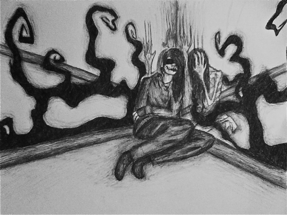
Adaptation B: Readjusting Ideas
So after a few discussions today I feel like I have a better understanding of what direction to go in for this project. I was slightly confused over the last week but I've been directing most of my focus towards the infographic as that is due in sooner. However, now that I feel like I am on the right track with that, I feel like I'm on a better path with this project too. Basically, my new aim is to create a relatively 'plain' or normal space that slowly begins to become more cramped as these masses begin to appear. These masses will be inspired by my old artwork in relation to mental illness and how it makes an individual feel. I'm aiming to exploit the idea of the uncanny/the abject to give the viewers an uneasy feeling. I also, as I've said previously, feel that soundscape will be vital and I hope to make the objects within my space to also speak using content gathered from various people.
 |
| Note: By "not really about anything" I more so just meant that there does not need to have/should not have a specific definitive ending, leaving it open or looping may give more of an impact and keep people thinking. |

I've realised that now I'm not quite sure what I'm actually meant to have for this specific project as I also want to bring this into third year. However, I feel that the use of a combination of software including Maya, Mudbox, ZBrush, and programs such as Substance Painter will be useful to create something realistic but also uncanny. I'm not quite sure how I'd animate the objects, but I quite liked the jittery animation of Little Otik (and by 'like' I mean it makes me feel uneasy). I also like some of the things in Agony, a game that I shared in a previous post as I feel the use of fleshy design, teeth, and other unusually organic materials as environments is interesting.
Overall, I'm happier with my direction now than I was, even though I feel it is slightly more blurred between environment and creature design but I'm ok with that. I also feel that this idea will be enhanced by a VR experience through both the visuals and auditory experience, while before I was losing the need for VR as it didn't enhance anything. In this post I'll include a few videos of things I feel inspire me currently along with a few more selected artworks I've done, but more can be found here.


Adaptation B: Speedpainting
I wanted to make a speedpainting using my old artwork and some thumbnails I've made so far for reference. I wanted it to be more painterly, like how my old artwork used to be when I hand painted it. I also used this painting to try out a few new brushes that I haven't used before. I quite like the results and I hope to make some more thumbnails and speedpaintings soon.

Sunday, 29 January 2017
Adaptation A: Name Tag Thumbnails
For the final step of 'building a DIY Frankenstein monster', my infographic recommends giving the creature a proper name. I thought that making a 'Hello my name is' tag would be a good visual to accompany this step. I mostly stuck to the typical rectangle shape but I also tested out some rounder shapes. I quite like #13 and #14 because 'my name is' is below the grey border and makes it look more interesting than it all being white lettering.

Adaptation A: Needle/Thread Thumbnails & Periodic Table of Elements
I've begun to make some assets for my infographic. I wanted to see what different types of needle shapes may work best considering it's meant to be used for sewing together body parts. I looked at some surgical needles but I've also drawn more straight needles just to experiment. I've also made my own Periodic Table of Elements so it fit with the rest of the fonts/designs. Since my main font does not contain numbers, I've been using a different font for the numbers that I think still matches reasonably well. My main font also does not really have lower case letters, so I decided to look at how the table would look with both my main font and the font I've been using for numbers. I quite like both but I think I prefer the one using my main font even if the lower case letters is just a slightly smaller version of the upper case letters.


Saturday, 28 January 2017
World Animation: Japan - Spirited Away
Despite the enormous amount of anime now available for viewers to watch, films made by Studio Ghibli always always stood out due to their unique style, intricate animation, and often deep, complex characters and themes. While there are a number of films made by this studio that were successful outside of Japan itself, there is no doubt that Hayao Miyazaki's Spirited Away (2001) was a massive success both within Japan and around the world. Despite it being aimed towards a younger audience, it resonates with nearly everyone.
One factor that could have influenced the success of Spirited Away could be due to its western influences which made it more palatable to those who do not often watch anime or other films/animations from Japan. "There are actually many Western influences and resemblances: Homer's Odyssey, Lewis Carroll, L Frank Baum..it's undoubtedly in a class and genre of its own: its alien, exotic qualities, all the more intense for a non-Japanese audience, are part of how extraordinarily pleasurable it is to watch," (Bradshaw, 2003). As the culture of Japan is so different from western countries such as America, the stories, characters, and themes in anime are often lost to those who aren't accustomed to it. Even though Miyazaki seemed to want appeal to the western world more than Studio Ghibli's previous films, it is clear that he put an immense amount of much love into Spirited Away. Proof of this is the depth of the characters, the themes throughout the film, and the dedication to art and animation that is consistent through the whole two hour film (which is quite long for an animated film).
It is hard to get people to fully understand how time consuming and labor intensive animation is unless they have made animations before. It is not a fast process and it is not an easy process even if computers are used. Good animation takes time, patience and practice, and it can be difficult to make the person or thing that is being animated to feel real and alive - to give it weight and true emotion. Miyazaki does this and more in Spirited Away, "animation is a painstaking process, and there is a tendency to simplify its visual elements. Miyazaki, in contrast, offers complexity...it would be easier to suggest vaguely moving presences, but Miyazaki takes care to include many figures we recognise. All of them are in motion. And it isn't the repetitive motion of much animation, in which the only idea is simply to show a figure moving. It is realistic, changing, detailed motion," (Ebert, 2012). Even in crowds of people, you can see faces that you recognise but are not needed for that specific scene. Them being there doesn't always have significance but it feels more realistic. The more you look at the surroundings the more little details you see going on. The personalities of the characters can be seen in their actions and movements at all times, nothing feels like stock or generic animation, everything is there to enhance the atmosphere - even if it is not part of the actual story. This gives realness and depth to the world that is absent from many other animated films.
Even though Studio Ghibli is considered to be 'the Disney of Japan', it is very distinct from Disney itself. Both Studio Ghibli and Disney worked together to bring Spirited Away to the rest of the world, but putting 'Walt Disney Studio Presents...' before Studio Ghibli's name on the film's poster feels unfair, "rather than Disney's Spirited Away, the movie could better be considered Mr. Miyazaki's 'Through the Looking Glass'...shifts of the character's personalities reflect what distinguishes Mr. Miyazaki from Disney or any other American Animator. His movies are as much about moodiness as mood, and the prospect of animated figures not being what they seem -- either spiritually for physically -- heightens the tension," (Mitchell, 2001). The amount of depth within Miyazaki's characters is unique when compared to other animations, and this is not limited to the main character. The majority of characters have a level of depth and complexity that is very unusual in an animated film, but it makes you more invested in the story. Even if it is so fantastical and culturally alien to some viewers that they do not understand why something is the way it is, they still go along with it.
Even if the audience doesn't always understand (most likely the western audience) why things happen, why there is a giant talking baby, why there are little fuzzy puff balls with eyes moving coal around, or why a spirit called No Face is so intent on becoming friends with a human, the story is still impactful. Spirited Away contains an array of themes that moral lessons that tend to be important values in Japanese culture. This includes caring for others (especially your family), respect (especially for your elders), working hard, and dedication. All of these themes are in Spirited Away and is shown as we see the main character, a 10 year old girl named Chihiro, grow up as she learns to overcome different obstacles. Initially she is stubborn, sullen, and relatively impolite. However, as she becomes more determined to save her parents and help her friends, she matures and achieves her goals, showing the audience that respect, dedication, and love are all important when it comes to growing up.
Interestingly though, it is not just the young Chihiro that is seen as somewhat unfavourable in the beginning of the film. One of the other main themes - if not the main theme - in Spirited Away is about greed and how greed has a negative impact on everyone. "Chihiro's parents fall eagerly upon the counter jammed with food and stuff their mouths...they eat so much they double or triple in size. They eat like pigs, and they become pigs. These aren't the parents of American animation, but parents who can do things that frighten a child," (Ebert, 2012). However, this is not the only example of how greed is expressed as toxic. Everyone in the bathhouse, where the film takes place, is obsessed with gold. It leads to the evil witch, Yubaba, to steal the names of her employees so they're locked into work due to the loss of their identity. The greed of the employees within the bathhouse corrupts No Face, who absorbs the emotions and energy that surrounds him. It also caused Haku, a river spirit who can shapeshift into a dragon, to steal a magic golden seal from Yubaba's sister which caused him to be gravely injured/sick. The main lesson is simple and obvious - do not be greedy.
Another interesting aspect of this film is the hinted jabs at pollution and urban expansion. While it isn't necessarily as direct as the other themes, once you look deeper into the film it can be seen hinted at throughout the story. "There is a malodorous heap of black slime, a river creature whose body has sopped up piles of pollution. Shape-shifting, so common in Japanese fantasy, takes place here, and the Haku, who first befriended Chihiro is revealed as a lithe sea dragon with fierce fangs," (Ebert, 2012). Both of these - the 'heap of black slime' and Haku - express the negative environmental impact that humans have. When the black slime first shows up at the bath house, everyone recoils in disgust and the job of serving the slime is thrust upon Chihiro. The little girl takes on the task, and then realises that something is wrong with the creature. Everyone works together and pulls all of the garbage and pollution out of the spirit, which is revealed to be a powerful water spirit. Chihiro is rewarded for her efforts. Similarly, Haku has forgotten his name after he sold himself to Yubaba, and cannot find his way back home. However, eventually Chihiro discovers that his name is actually the Spirit of the Kohaku River. The reason why he could not figure out his name was partially due to the fact that his river was destroyed by humans to make room for apartments. Perhaps this is partially why Chihiro is initially met with hostility as she is a human.
It is unquestionable that Spirited Away is something special, as indicated by becoming the highest grossing film in Japan in history, becoming the most successful Japanese film worldwide, and being given several awards. Miyazaki made something more than a long anime film, he added complexity and depth that was not needed but is admired and appreciated. He showed the world that even if the Japanese culture is very different to western cultures, we all have similar values and can enjoy the same things. Spirited Away provided an intricate, involved story that related to various cultures, societies, and age groups while delivering genuine messages about respect, dedication, compassion, generosity, and kindness.
Bibliography:
Bradshaw, P. (2003) Spirited Away At: https://www.theguardian.com/film/2003/sep/12/spirited-away-review Accessed on: 28/1/2017
Ebert, R. (2012) Spirited Away At: http://www.rogerebert.com/reviews/great-movie-spirited-away-2002 Accessed on: 28/1/2017
Mitchell, E. (2002) Film Review; Conjuring Up Atmosphere Only Anime Can Deliver At: http://www.nytimes.com/movie/review?res=9504E0DB1030F933A1575AC0A9649C8B63 Accessed on: 28/1/2017
Peters, P. (2014) Spirited Away Review At: http://www.empireonline.com/movies/spirited-away/review/ Accessed on: 28/1/2017
Illustration List:
Figure 1. Spirited Away [Poster] At: http://www.impawards.com/2002/posters/spirited_away.jpg Accessed on: 28/1/2017
Figure 2. Crowd of Familiar Faces Wave Chihiro Goodbye [Film Still] At: http://caps.pictures/200/1-spirited-away/full/spirited-away-disneyscreencaps.com-14105.jpg Accessed on: 28/1/2917
Figure 3. Helping the River Spirit [Film Still] At: http://screenprism.com/assets/img/article/spirited-away-full-402308.jpg Accessed on: 28/1/2017
 |
| Fig 1. Spirited Away (2001) |
It is hard to get people to fully understand how time consuming and labor intensive animation is unless they have made animations before. It is not a fast process and it is not an easy process even if computers are used. Good animation takes time, patience and practice, and it can be difficult to make the person or thing that is being animated to feel real and alive - to give it weight and true emotion. Miyazaki does this and more in Spirited Away, "animation is a painstaking process, and there is a tendency to simplify its visual elements. Miyazaki, in contrast, offers complexity...it would be easier to suggest vaguely moving presences, but Miyazaki takes care to include many figures we recognise. All of them are in motion. And it isn't the repetitive motion of much animation, in which the only idea is simply to show a figure moving. It is realistic, changing, detailed motion," (Ebert, 2012). Even in crowds of people, you can see faces that you recognise but are not needed for that specific scene. Them being there doesn't always have significance but it feels more realistic. The more you look at the surroundings the more little details you see going on. The personalities of the characters can be seen in their actions and movements at all times, nothing feels like stock or generic animation, everything is there to enhance the atmosphere - even if it is not part of the actual story. This gives realness and depth to the world that is absent from many other animated films.
 |
| Fig 2. Crowd of Familiar Faces Wave Chihiro Goodbye |
Even if the audience doesn't always understand (most likely the western audience) why things happen, why there is a giant talking baby, why there are little fuzzy puff balls with eyes moving coal around, or why a spirit called No Face is so intent on becoming friends with a human, the story is still impactful. Spirited Away contains an array of themes that moral lessons that tend to be important values in Japanese culture. This includes caring for others (especially your family), respect (especially for your elders), working hard, and dedication. All of these themes are in Spirited Away and is shown as we see the main character, a 10 year old girl named Chihiro, grow up as she learns to overcome different obstacles. Initially she is stubborn, sullen, and relatively impolite. However, as she becomes more determined to save her parents and help her friends, she matures and achieves her goals, showing the audience that respect, dedication, and love are all important when it comes to growing up.
Interestingly though, it is not just the young Chihiro that is seen as somewhat unfavourable in the beginning of the film. One of the other main themes - if not the main theme - in Spirited Away is about greed and how greed has a negative impact on everyone. "Chihiro's parents fall eagerly upon the counter jammed with food and stuff their mouths...they eat so much they double or triple in size. They eat like pigs, and they become pigs. These aren't the parents of American animation, but parents who can do things that frighten a child," (Ebert, 2012). However, this is not the only example of how greed is expressed as toxic. Everyone in the bathhouse, where the film takes place, is obsessed with gold. It leads to the evil witch, Yubaba, to steal the names of her employees so they're locked into work due to the loss of their identity. The greed of the employees within the bathhouse corrupts No Face, who absorbs the emotions and energy that surrounds him. It also caused Haku, a river spirit who can shapeshift into a dragon, to steal a magic golden seal from Yubaba's sister which caused him to be gravely injured/sick. The main lesson is simple and obvious - do not be greedy.
Another interesting aspect of this film is the hinted jabs at pollution and urban expansion. While it isn't necessarily as direct as the other themes, once you look deeper into the film it can be seen hinted at throughout the story. "There is a malodorous heap of black slime, a river creature whose body has sopped up piles of pollution. Shape-shifting, so common in Japanese fantasy, takes place here, and the Haku, who first befriended Chihiro is revealed as a lithe sea dragon with fierce fangs," (Ebert, 2012). Both of these - the 'heap of black slime' and Haku - express the negative environmental impact that humans have. When the black slime first shows up at the bath house, everyone recoils in disgust and the job of serving the slime is thrust upon Chihiro. The little girl takes on the task, and then realises that something is wrong with the creature. Everyone works together and pulls all of the garbage and pollution out of the spirit, which is revealed to be a powerful water spirit. Chihiro is rewarded for her efforts. Similarly, Haku has forgotten his name after he sold himself to Yubaba, and cannot find his way back home. However, eventually Chihiro discovers that his name is actually the Spirit of the Kohaku River. The reason why he could not figure out his name was partially due to the fact that his river was destroyed by humans to make room for apartments. Perhaps this is partially why Chihiro is initially met with hostility as she is a human.
 |
| Fig 3. Helping the River Spirit |
Bibliography:
Bradshaw, P. (2003) Spirited Away At: https://www.theguardian.com/film/2003/sep/12/spirited-away-review Accessed on: 28/1/2017
Ebert, R. (2012) Spirited Away At: http://www.rogerebert.com/reviews/great-movie-spirited-away-2002 Accessed on: 28/1/2017
Mitchell, E. (2002) Film Review; Conjuring Up Atmosphere Only Anime Can Deliver At: http://www.nytimes.com/movie/review?res=9504E0DB1030F933A1575AC0A9649C8B63 Accessed on: 28/1/2017
Peters, P. (2014) Spirited Away Review At: http://www.empireonline.com/movies/spirited-away/review/ Accessed on: 28/1/2017
Illustration List:
Figure 1. Spirited Away [Poster] At: http://www.impawards.com/2002/posters/spirited_away.jpg Accessed on: 28/1/2017
Figure 2. Crowd of Familiar Faces Wave Chihiro Goodbye [Film Still] At: http://caps.pictures/200/1-spirited-away/full/spirited-away-disneyscreencaps.com-14105.jpg Accessed on: 28/1/2917
Figure 3. Helping the River Spirit [Film Still] At: http://screenprism.com/assets/img/article/spirited-away-full-402308.jpg Accessed on: 28/1/2017
Thursday, 26 January 2017
Maya Class: Using Dope Sheets II
Today in the lesson I continued working on keying the extreme poses. I also began keying the inbetweens and I think it's coming out okay. I'm trying to not obsess over the graph editor just yet because I know things will be moved around more as I set up more poses. Things still glide a bit but I know I will be able to fix this later on.

Wednesday, 25 January 2017
Adaptation B: Thumbnails & Brainstorming III
After watching the animation Ego, I wanted to brainstorm and see what sort of real life locations I could possibly start my story/animation in. Out of my ideas I feel like I'm preferring a bedroom simply because it's a place that is normally a place of comfort and security. I feel that it suddenly turning into this unwelcoming trap or mental space could be interesting, something to show how some people feel so trapped in their own security if that makes sense. I felt that bathrooms were too common in the horror genre, and a hospital room may not have as much impact because it's already a relatively cold, scary location for many people. Again, these are just early ideas and I'm going to continue exploring.
I've watched some tutorials in VR/AR/MR on Lynda.com and I've learned some things that I think will be useful because I wouldn't have considered them immediately such as ensuring things are at real life scale, the height of the character and the width of doorways to feel like the viewer has shoulder/head space that feels real. I'm also considering looking more into a 180° animation vs a 360° animation simply because I'm not sure if I'd be able to lock the viewer into place so they could see what was going on, but I'm also not sure if this would matter or if there were other ways of ensuring the viewer is looking at things at the right time. I'm not sure if using VR to have a sort of first person experience without turning your head would be enhanced by VR that much or if there is a way to at least limit how far the viewer can turn.. Alternatively I could see if I could learn how to make events so they happen when they are looked at but I'm not quite sure how to do this, but I have time to consider options as I develop my idea, I may be overthinking it.
I've also done a few more really rough sketches of the creature, I'm enjoying drawing it loosely at the moment, just to see what elements of it I like. For example, do I want it to have legs, do I want it to be more of a phantom without legs, do I want it to have more animal-like legs than human ones, do I want it hunched over, do I want it to have horns or sharp teeth...all things that I'm exploring. I've also tried incorporating some spider-like qualities to it as I'm terrified of spiders and I wanted to see what would happen.


Adaptation A: Influence Map, Planning for Artwork & New Music Test
So I decided to try out another piece of music for my animation as I knew the piece I used last time I didn't like. I got some feedback from a few people and out of the selection I had, this seemed to be the most preferred but I'll continue looking just in case there's something I like more. I think some added sound effects will improve it a lot and the timing is currently off because I didn't edit the original footage for it yet. I've also gone through my video and tried to plot out assets I need for my infographic and some different ways I could do it and what I could add in possibly.


Tuesday, 24 January 2017
Autodesk Mudbox: Importing & Exporting
Today we learned a bit more about importing and exporting files to and from Mudbox. Todays tutorial was a bit of a struggle, not because of the content we were learning but because Mudbox continuously crashed which made it difficult to make progress and follow along with the lesson. Despite this, I did my best to do some quick sculpting and painting so I could try exporting back into Maya and exporting/importing files with Photoshop. I didn't run into any problems with that and I was able to get a barcode onto my robot using Photoshop, although it came in slanted and I didn't have time to fiddle around with it too much. I found this lesson as useful as I could considering how slow Mudbox was being. I struggle a lot with getting things to look smoothed out or to create even, hard edges but I'm hoping I'll get the hang of it as I practice. I also wonder if ZBrush would be better for this and if it'd be worth seeing if there is a trial or something so I can give it a try. I've also exported the robot as a turnaround just so I could see how that works.


Adaptation A: Old Film Effects #2 with Music
I decided to type out my 'steps' and string them together in a video. I figured this way I can try to plot out what sort of things I'll need to design. I've also decided to begin looking at some music to try and get some pacing. Out of the music I've found so far, the one I've put in the video is my favourite but I'm going to continue looking and I'll eventually add other sound effects. There is currently no animation on the text, but I've found a few very useful tutorials on Lynda.com so I'll begin looking into some methods of animating. I'll also begin drawing assets that I need, which may in turn remove some of the text that is in this video right now.
Sunday, 22 January 2017
Adaptation A: Old Film Effects Test #1
Since I'm currently going for an old, silent film sort of aesthetic for my infographic I decided to look at some tutorials online about how I could do this. Some tutorials used stock footage to overlay on the footage you want to make look old, but I wanted to find one where I made the dust/scratches/spots on my own without using stock footage. The border is a stock image but I'll probably experiment with other borders I could use for this. After I completed the tutorial, I played around with some of the settings so it'd come out in a way I liked more than the default result of the tutorial. Overall I'm happy with the outcome, but I may continue to play with the settings and try out a few other tutorials to see what some other options may be


Saturday, 21 January 2017
Maya Pipeline 1: UV Layout - Body & Exporting Maps (Part 2)
I've finished laying out the UV's for the body and I've organised the pieces then exported the maps ready for texturing. Again, I'm surprised how quick and easy laying out UV's has become and I'm happy it isn't as much of a time consuming chore as it was before. This time I didn't run into any problems and I'm now all ready for the next set of tutorials.


Maya Pipeline 1: UV Layout - Head & Head Details (Part 1)
This tutorial went a lot faster than I expected. I like using the Unfold 3D plug-in that Maya has now, it makes the process a lot faster than it used to be. Some strange things happened sometimes when I was laying out the UV's but it was just my Maya acting up on my laptop (once I restarted the program it worked fine). Next is to layout the UV's for the body.


Adaptation B: Rough Story Idea & More Influences
Today I decided to try and start writing down things that frighten me (which will be posted in the next few days) so I could try to incorporate them into my sketches to make them more interesting. While doing this, I thought of a very rough idea for a story. Again, this is very rough and it has flaws obviously, it's just an idea that popped into my head as I was brainstorming but I thought I'd type it out and share it so I didn't forget...but it's something. I'm trying to not think 'oh well how would I do that in Maya' just yet since I know the end result will be something completely different. I hope to come up with more ideas soon. I've also found some more images and videos that I feel may relate to my project in terms of visuals, sound, and themes.


Friday, 20 January 2017
World Animation: Australia - Mary and Max
Most popular animated films, if it's CGI animation or stop motion animation, tend to be aimed towards children or a younger audience. However, Adam Elliot's claymation film, Mary and Max (2009), contains more serious themes that are very rarely, if ever, seen in mainstream feature film using stop motion animation, "tackling such un-animation topics such as loneliness, body image, alcoholism, suicide, and Asperger's syndrome, it's quirky, compassionate and slightly seedily sweet," (Parkinson, 2010). This resulted in a film that some may feel is choppy due to the contrast between the serious themes and the cuter aesthetic of the film. However, Mary and Max proves that not all animated feature films have to be happy, cheerful, and made for children.
It'd be a lie to say that Mary and Max wasn't an incredibly depressing film. But, the claymation along with the humour prevents the heavy themes from weighing down the entire film too much. If anything, this makes for a rather accurate representation of how much of a roller coaster normal human life is. "Suicide and death are rampant; diseases and disorders are commonplace; drugs and alcohol are necessities; good intentions are read as outright threats and faith is completely betrayed...yet Elliot suggests that Mary's naiveté and Max's Aspergers allow both of them a certain innocence in this world, maybe even optimism," (Cabin, 2010). One, some or all of these themes are most likely present in every single person's life at one point or another which makes this film and its characters relatable, allowing the viewers to empathise with them. Perhaps if an audience was bombarded with all of these themes in a life action film instead of a claymation, it'd be too sickeningly depressing.
The animation itself, while often being associated with children's films, not only contains innocence but also some more morbid, adult themes such as Max's pet fish getting killed (repeatedly), Mary's parents dying, scenes involving alcoholism, suicide attempts, anxiety attacks and mental wards. Somehow, even in its cutesy style, it works. Perhaps the limited colour scheme allowed this claymation to still feel serious while highlighting on important objects, "all of this is rendered in almost completely monochromatic claymation - only occasional colours stand out, such as the red pompom Mary sends to Max," (Pulver, 2010). It also helps the audience see how the world is different but similar between Mary's brown toned Australian environment and Max's grey life in New York City. The colours definitely feel like they match the locations and characters. Despite it all being made of clay, the camera work was beautiful and the environments were engaging and immersive.
Another thing that helps lift up the gloom of this film is deadpan, Australian humour. While the film does not make obvious, direct jokes, the sarcasm of the narrator and some of the dialogue between Mary and Max is funny...often because it is the blunt truth or is a normal, awkward situation. It makes fun of every day life and how awful things can be, perhaps poking fun at it is a way to cope with the unpleasantness of reality. It also makes some dirty jokes and it contains quite a bit of toilet humour which all mixes into the blunt, witty dialogue and normal awkward daily life. It is funny because it shows how strange humans are/can be and how absurd and silly life is, "the serious sadness underpinning Elliot's vision only makes the humour work better," (Robey, 2010).
Despite the film having sadness, anxiety, and frustration woven throughout its entire duration, the film was enjoyable and refreshingly real for an animation. This film makes you think about your life, what you've gone through, while also considering the similar struggles that others surrounding you face. It incorporates the awkwardness of everyday human life and makes fun of it, maybe trying to get people to just laugh a little bit about themselves and gain some perspective. It shows that we may have more in common with each other than we may think. Credit must be given to Adam Elliot as it is unquestionably difficult to make clay characters come to life, let alone adding enough heart, emotion and authenticity to them to make them relatable to an audience. Even though this film has flaws, one must remember that one of the film' main themes is 'not everything is, or can be perfect... and that's okay'. It is a shame that this film has not received more recognition, but it is certainly a hidden gem that should be appreciated for its uniqueness and truthful perception of life.
Bibliography:
Cabin, C. (2010) Mary and Max At: http://www.slantmagazine.com/dvd/review/mary-and-max Accessed on: 20/1/2016
Chang, J. (2009) Review: 'Mary and Max' At: http://variety.com/2009/film/markets-festivals/mary-and-max-1200473302/ Accessed on: 20/1/2016
Parkinson, D. (2010) Mary And Max Review At: http://www.empireonline.com/movies/mary-max/review/ Accessed on: 20/1/2016
Pulver, A. (2010) Mary and Max - review At: https://www.theguardian.com/film/2010/oct/21/mary-and-max-review Accessed on: 20/1/2016
Robey, T. (2010) Mary and Max, review At: http://www.telegraph.co.uk/culture/film/filmreviews/8078477/Mary-and-Max-review.html Accessed on: 20/1/2016
Illustration List:
Figure 1. Mary and Max [Poster] At: https://digitalnews.ua.edu/wp-content/uploads/2014/03/mary-and-max-26769-hd-wallpapers.jpg Accessed on: 20/1/2016
Figure 2. Monochromatic [Film Still] At: https://cartoonessays.files.wordpress.com/2015/09/mary-and-max-3.jpg Accessed on: 20/1/2016
Figure 3. "You are imperfect, and so am I." [Film Still] At: http://data.whicdn.com/images/41007025/large.jpg Accessed on: 20/1/2016
 |
| Fig 1. Mary & Max (2009) |
It'd be a lie to say that Mary and Max wasn't an incredibly depressing film. But, the claymation along with the humour prevents the heavy themes from weighing down the entire film too much. If anything, this makes for a rather accurate representation of how much of a roller coaster normal human life is. "Suicide and death are rampant; diseases and disorders are commonplace; drugs and alcohol are necessities; good intentions are read as outright threats and faith is completely betrayed...yet Elliot suggests that Mary's naiveté and Max's Aspergers allow both of them a certain innocence in this world, maybe even optimism," (Cabin, 2010). One, some or all of these themes are most likely present in every single person's life at one point or another which makes this film and its characters relatable, allowing the viewers to empathise with them. Perhaps if an audience was bombarded with all of these themes in a life action film instead of a claymation, it'd be too sickeningly depressing.
The animation itself, while often being associated with children's films, not only contains innocence but also some more morbid, adult themes such as Max's pet fish getting killed (repeatedly), Mary's parents dying, scenes involving alcoholism, suicide attempts, anxiety attacks and mental wards. Somehow, even in its cutesy style, it works. Perhaps the limited colour scheme allowed this claymation to still feel serious while highlighting on important objects, "all of this is rendered in almost completely monochromatic claymation - only occasional colours stand out, such as the red pompom Mary sends to Max," (Pulver, 2010). It also helps the audience see how the world is different but similar between Mary's brown toned Australian environment and Max's grey life in New York City. The colours definitely feel like they match the locations and characters. Despite it all being made of clay, the camera work was beautiful and the environments were engaging and immersive.
 |
| Fig 2. Monochromatic |
Another thing that helps lift up the gloom of this film is deadpan, Australian humour. While the film does not make obvious, direct jokes, the sarcasm of the narrator and some of the dialogue between Mary and Max is funny...often because it is the blunt truth or is a normal, awkward situation. It makes fun of every day life and how awful things can be, perhaps poking fun at it is a way to cope with the unpleasantness of reality. It also makes some dirty jokes and it contains quite a bit of toilet humour which all mixes into the blunt, witty dialogue and normal awkward daily life. It is funny because it shows how strange humans are/can be and how absurd and silly life is, "the serious sadness underpinning Elliot's vision only makes the humour work better," (Robey, 2010).
Despite the film having sadness, anxiety, and frustration woven throughout its entire duration, the film was enjoyable and refreshingly real for an animation. This film makes you think about your life, what you've gone through, while also considering the similar struggles that others surrounding you face. It incorporates the awkwardness of everyday human life and makes fun of it, maybe trying to get people to just laugh a little bit about themselves and gain some perspective. It shows that we may have more in common with each other than we may think. Credit must be given to Adam Elliot as it is unquestionably difficult to make clay characters come to life, let alone adding enough heart, emotion and authenticity to them to make them relatable to an audience. Even though this film has flaws, one must remember that one of the film' main themes is 'not everything is, or can be perfect... and that's okay'. It is a shame that this film has not received more recognition, but it is certainly a hidden gem that should be appreciated for its uniqueness and truthful perception of life.
 |
| Fig 3. "You are imperfect, and so am I." |
Bibliography:
Cabin, C. (2010) Mary and Max At: http://www.slantmagazine.com/dvd/review/mary-and-max Accessed on: 20/1/2016
Chang, J. (2009) Review: 'Mary and Max' At: http://variety.com/2009/film/markets-festivals/mary-and-max-1200473302/ Accessed on: 20/1/2016
Parkinson, D. (2010) Mary And Max Review At: http://www.empireonline.com/movies/mary-max/review/ Accessed on: 20/1/2016
Pulver, A. (2010) Mary and Max - review At: https://www.theguardian.com/film/2010/oct/21/mary-and-max-review Accessed on: 20/1/2016
Robey, T. (2010) Mary and Max, review At: http://www.telegraph.co.uk/culture/film/filmreviews/8078477/Mary-and-Max-review.html Accessed on: 20/1/2016
Illustration List:
Figure 1. Mary and Max [Poster] At: https://digitalnews.ua.edu/wp-content/uploads/2014/03/mary-and-max-26769-hd-wallpapers.jpg Accessed on: 20/1/2016
Figure 2. Monochromatic [Film Still] At: https://cartoonessays.files.wordpress.com/2015/09/mary-and-max-3.jpg Accessed on: 20/1/2016
Figure 3. "You are imperfect, and so am I." [Film Still] At: http://data.whicdn.com/images/41007025/large.jpg Accessed on: 20/1/2016
Thursday, 19 January 2017
Testing Out Sketchfab - Bacteria Models
Since for my Adaptation B project may involve VR, I wanted to see what options I had for viewing my work in VR. I found out that Vimeo doesn't currently support it but Facebook, YouTube, and Sketchfab does. I've seen Sketchfab on Artstation before so I decided to give it a go. I tried to make these models work with a cycled animation but I think since I had to have a high resolution under a low resolution model it'd mess with the animation and weird things would happen. I may try it with my Leviathan model though since he wasn't made that way.


Wednesday, 18 January 2017
@Phil - Critical Perspectives: Proposal Piñata
I tried listing a bunch of different things I was interested in then mashing together a few I thought worked together. The combinations that are starred are the ones I currently prefer...I think some of the ones out of those that have the most potential is Horror + Feminism and Black Mirror & Social Media. I feel that Doctor Who + Identity would be interesting although I'm not sure if 'identity' is the correct word for it, I couldn't figure out another word to match what I meant.


Subscribe to:
Posts (Atom)