It's been a crazy couple of weeks involving New Designers, job interviews, and travelling. While it's been somewhat overwhelming I'm very happy and excited to get back into being creative and artistic. This summer I am going to be working on another instalment of CAA and ONE - this project being 'Romeo & Juliet'. Like 'Red & The Kingdom of Sound'...Romeo & Juliet is a production revolving around classical music. However, this is very different from Red. For more information please visit this blog post.
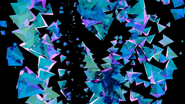
My job for this project is to receive simulations from Ethan Shilling and texture, light, and frame them in interesting/beautiful ways. Here are a few of my initial tests using a simulation provided to me. The first test I combined several aiStandardSurface presets and created a sky dome light.
I decided to render out an animation to see how the texture would look while it was moving. I wanted to see what I could do to add some variety to the colour so I added a Hue/Saturation effect and animated it. This first colour animation test is not driven by the music, it is purely to see what it would look like.
Afterwards, however, I did some research into how to attach different effects and attributes to audio in After Effects. I first used Keyframe Assistant to convert the audio waves into keyframes and then I played around with smoothing them a little. I then created an adjustment layer and added a Color Balance effect to it. From here I created an expression on the 'hue' setting of the Color Balance effect and attached it to the audio keyframes. The effect at first was too subtle to make any change, so I stretched out the keyframes so there was a more noticeable change.
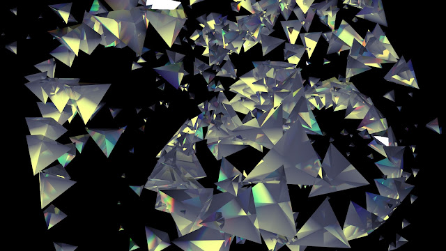
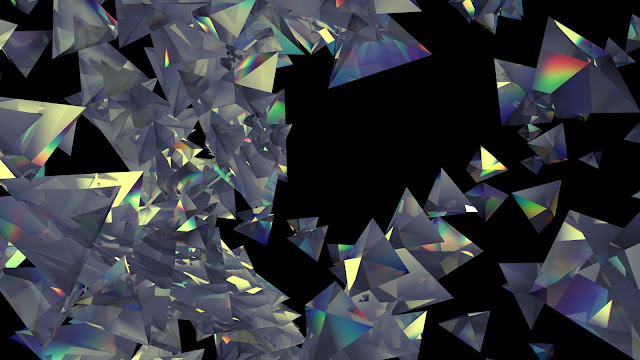
For my next set of tests I decided to attempt to turn all of the triangle shapes into individual prisms so they would hopefully give off rainbow reflections. I did this by using a glass preset and adjusting a couple of the settings. For these renders I also used a directional light and I later on played around with the audio-driven color balance effect in After Effects.
For the third test I created a brushed copper/gold texture and alternated between using area lights and spot lights. I also created an aiAtmosphereVolume for this test to create some light ray effects. After some feedback I created a test animation that was closer up to the geometry rather than in the distance. I really like how this came out and I imagine it'd look better with some depth of field blurring as well as some motion blurring.


No comments:
Post a Comment