Today I worked on updating my wires texture/object for the line When I see hospitals I feel wires. I used a similar technique I worked with months ago, where I created CV curves and edited them before extruding long the curve to create a mesh. I created a polygon sphere, similar to many of my other objects, and used it to snap the control points of the curve so the curves eventually took a spherical shape. I rebuilt the curve several times during this process, to ensure everything was spaced out the way that I wanted to ensure the wires animated smoothly later on.
Previously, I used a NURBS primitive to extrude along the curve but this time I chose to create a polygon cylinder using a script which created additional settings that allowed me to animate how far along the curve the polygon mesh was. This allowed me to make the wires look like they are snaking and winding around into their final shape. For the texture I used the Rubber preset on the aiStandardSurface shader but made the wires a bit darker since the grey faded into the background (it is now darker than the renders below, but I still like how it looks in these renders).
Below are three playblasted animation tests (not fully rendered). The first one the wires are already fully extruded and are not animated, the second has animated wires, and the third has completely different camera animation and different timing. Out of my three animation tests I like #3 the most because it feels sinister and lingering. I also feel as though the wires/shape of the wires resembles blood vessels or the human nervous system when other parts of the body are stripped away (medical diagrams or anatomy museum models).
Today I've been spending some time looking at reference photos of pufferfish as I use Mudbox and Substance Painter to create my textures. Unlike my previous experiments, I modelled into the sphere since I wanted the spines to be facing downwards (I wasn't sure how I could achieve this with a 2D displacement map). I've brought that model into both Mudbox and Substance Painter to create my height, normal, gloss, specular, and diffuse maps.
I'm finding that I prefer Substance Painter, but I do like the normal map I created using Mudbox so I may play around and combine the maps I am making. I also think that my textures will look better (or at least different) once I bring them into Arnold since they will have subsurface scattering after I apply them to the AiStandardSurface material. I'm trying to not fuss over making it 100% accurate since I'm mostly trying to get it to resemble a pufferfish rather than it being an actual pufferfish. I like how it is turning out so far, but it still needs quite a bit of work...but here is my progress so far.
Today I spent a bit of time testing out some textures for the line "When I see pancakes I see my Grandfather". I decided to work more with the idea of maple syrup for several reasons. One being I think that a shiny, caramel/golden coloured orb would be more appealing than the molecule being textured like a pancake. I also feel it'd be interesting to see what I could do with projections and transparency (so seeing the projections through the molecule).
I also think if it's lit the right way, the syrup express the emotions that I want for this line in the poem (simple, sweet, homely, warm, clear). To me, maple syrup also reminds me of my time with my family in Vermont...the whole idea of maple, sugar, and autumn are all comforting to me and remind me of pleasant times of my childhood. I remember talking about real syrup vs fake syrup while making pancakes with my Grandfather. Overall, I feel that going for syrup rather than a pancake texture would be more pleasant to look at than a pancake texture and I feel it has meaning even if it isn't the pancake itself.
I found it difficult to work with these tests, which I think is due to the syrup texture being transparent. Since it's in a large empty space (in the Maya scene, the sphere isn't near any walls), it's a bit hard to determine if it's correct since I can't see how reflections, refractions, lights, and transparency work together. I did add a deformer on to the orb just so I could try to get a better idea of how the shader was behaving, but I think it'd be useful to do more tests for this material but in the inverted room set so I can see how everything is looking more accurately. I also experimented a bit with putting a point light within the orb, but unfortunately I didn't save those images so I will need to recreate them because I thought they looked interesting. I think this material (once I get a better idea of how it's working) will be a useful one to test out different coloured lights/light temperature.
Now that the Minor Project submission is over, I returned to some suggestions I was given in regards to my crystal/gem. I created a quick height and diffuse map using some photos and applied it to the sphere. I applied a Frosted Glass preset on the AiStandardSurface shader and began experimenting with the displacement and the colours.
I wanted this material to resemble something more raw and crystal-like rather than something like a polished diamond. This is because I relate 'precious gem' to 'anorexia' I think of those crystal growing kits - something that is unnatural but is also beautiful and captivating. I also think I want to try out some materials that look more like a geode. I've also begin experimenting with animating maps in After Effects to see if I could make some sort of animated crystal map.
I mostly focused on colour with these tests, once I added in some colour to the scatter channel I think the object began to look really interesting. Out of these I think Gems 004 and 007 are my favourites. It was fun combining different colours for the scatter, transmission colour, and specularity to see how they interacted with each other
As I wanted to work a bit on some bone materials, I had a look at some reference. I looked a lot at the internal structure of human bone, especially bones that were afflicted with Osteoporosis. I did this because those who suffer from Anorexia are often diagnosed with Osteopenia or Osteoporosis due to the lack of nutrients, causing bone density to decrease.
Now that I'm planning on moving onto some other textures/materials, I thought it would be a good idea to share some influence maps showing some images that I looked at while creating my ice and sponge textures. Since I'm trying to achieve relatively realistic results, I know that looking at reference is very important (for some materials I may go out and find reference myself so I can look at them more in person). These textures may still require some tweaking as time goes on, but I also want to move onto textures such as chicken skin.
For the snow/ice texture, I decided to go with ice because it reminded me of the frozen lake in front of my grandparent's house. I may see if I can add some snow details onto it or perhaps find some special effects to give it a sort of dry ice fog/mist effect. For the sponge I looked both at sea sponges and synthetic sponges and I may still experiment with some other colours. I have begun looking at both chicken skin and human skin for reference, I'm pretty sure I'm going to go for a raw chicken skin rather than a cooked one as raw meat - especially poultry - is repulsive to me and I'm often nervous about handling.
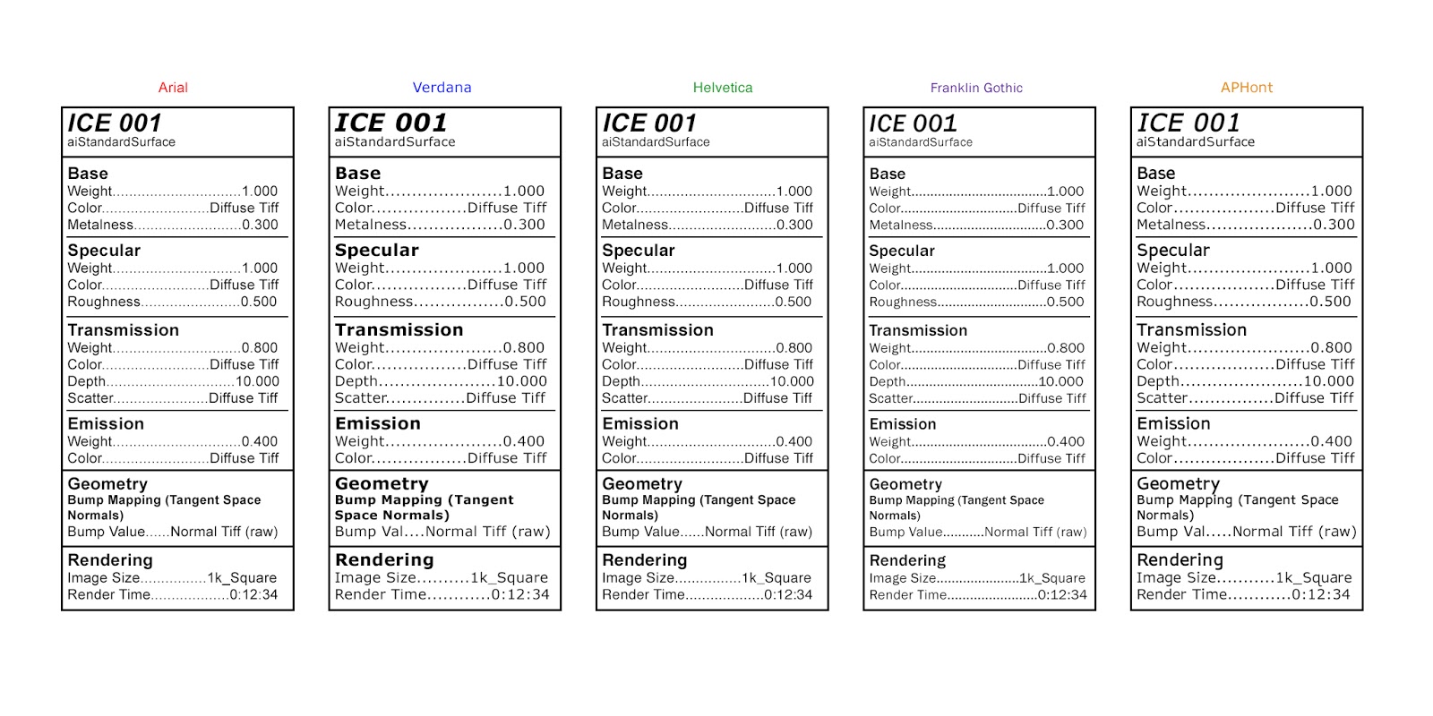
To further evoke a sense of 'hospitalisation' or some sort of institution, I was encouraged to explore ways of labelling my texturing experiments that will later on help me design my Art Of document. After some conversations, it became clear that it would be a good idea to explore the font and layout of medical prescriptions, pill packets/drug information tables, and nutritional information. It's odd because before I started actually looking at references, I didn't realise how similar medication labels and nutrition labels were which I think is interesting considering what my project is about.
I also researched a little online about which fonts are best for nutrition information and medication/drug information. Both of them recommend clear, easy to read fonts such as Arial, Helvetica, Franklin Gothic, and Verdana. I also found on this website that recommends using APHont as it is apparently easier to see for those who have weaker vision (I saw several other websites mention this font as well). I explored these fonts in the tests below, which were inspired by 'Drug Facts' (specifically the 'Active ingredients' section). I think out of all these fonts I prefer Helvetica, Arial, and APHont but I think I want to explore a few other fonts too. Some fonts were wider so for this test, some of the 'Bump Value' sections were shortened to 'Bump Val'...I'd change this in the final version but for this test I wanted everything to be the same dimensions. The render time in this is also made up for now.
I think this will be really interesting when paired with my texture tests. I need to figure out what backdrop/ground I want when rendering these images as well so I can keep it consistent throughout all the textures. I also plan to explore a few other layouts for these labels...for example, maybe including some bullet points or having it be more similar to a food label instead.
Over the last week I've been working to get some initial takes of my voiceover. Doing my own voice acting is something that I admit I've been terrified to try out - any sort of acting, even voice acting, is way beyond my comfort zone. However, since this project is so personal and it feels so important to me I am doing my best to work past that and make a decent voiceover. Once the sound booth at UCA was up and running after some technical issues, I spent a few hours over the course of two days to get as many initial take as I could. For the first clips I kept it relatively simple so I had a base and to ensure that I had the ability to do it and that it should indeed be me doing it in the first place. Over the next few weeks I'm going to work on adding more expressiveness to my voiceover...I hope as I practice and do it more I'll get better. I did find that the second day I recorded I did better and felt more comfortable so I hope that continues.
While I'm not including any of the voiceover clips in this post (maybe I'll include some once I have a final version), as I spoke the words I thing I had a better idea of what I wanted my poem and animation to be like. I decided to scrap the line "When I think of my family I feel dread" as I feel that this line in combination with the other lines, was unbalanced and leaned towards a more negative feeling towards my family. This is not what I wanted as I more so wanted to express a sort of 'guilty' or 'split' feeling in regards of my family.
I also spent some time looking at some spoken word/poetry readings in hope that it'll help me get more expressive in my recordings. Here are some I found powerful...Neil Hilborn has always been one of my favourite poets to listen to.
Between working on YPGTTO, I've been trying to look at imagery so I can hopefully get a better idea of what I'd like my animation to possibly be. Some of these videos include some films and artists that I find interesting. I've come across work by Murat Pak that I found to be very interesting. I liked how simplistic, 'clean', and realistic yet slightly unsettling these animations are.
Some of the films I found most interesting was a series called 'The Node' - each version has the same footage but different audio/music artists responded to it. Some of my favourites include Reality Eight, Reality Seven, and Reality Three. I think that this is an interesting approach to this film because each film has a very different feel and that is all dependent on the sound. I enjoyed Reality Eight because of the spoken words, I enjoyed the music in Reality Seven, but I felt the most emotional impact from the sound in Reality Three.
I've also tried looking at some other videos that is just stock footage/imagery related to my phrase list. I'm hoping to use these images to eventually put together a sort of pre-vis for my animation. I've been looking at some images and videos of things such as pufferfish, spines, autumn leaves, slugs, sugar and so on. I wonder if it may be interesting to incorporate some live action footage into my animation in some way...but for the CGI elements I do think it would be a good idea to keep it simplistic and clean so it is hopefully more impactful
After more discussions, I have a somewhat solidified list. I still need to narrow things down...I'm trying to remove things that I don't feel are as impactful or phrases that I feel are somewhat repetitive/do not offer much more than other phrases already have. I'm finding this quite difficult since all of them have emotional weight for me so it's hard to pick the 'less important' ones but I'm also trying to consider what may or may not work in terms of visuals and transitions as well. These are just my initial thoughts on the list and obviously they may still change and develop.
I'm also trying to look at some more animations and tutorials in hopes I can try to get a more concrete idea of what I want my film to be and/or some techniques that may be helpful. At the moment I'm looking into the possibility of using blend shapes to morph an object into a range of different shapes but I'm not quite sure if that'd be the best. I also wonder if perhaps animating bump/displacement maps may be an interesting thing to explore.
Admittedly I've so far kept my Minor Project ideas behind closed doors, but I now feel ready to begin sharing my thoughts and ideas on this project (which I temporarily labelled as 'When' - this obviously may change). Dysmorphia was a very personal piece of work for me - and it helped me discover how to use Maya as an art medium rather than a mechanical piece of software.
Dysmorphia (film still)
I really enjoy working with Maya, After Effects and other programs, and the topic of Mental Illness/ internal conflict is something I still feel I need to explore and discuss. This is why for my Minor Project I want to create a piece of work that is even more raw and honest in hopes it may help people understand that everyone experiences the world differently.
To get started on this, I've been given a list of questions/prompts to answer as honestly as I can. Some were direct, some more abstract, and some intended to be more directly triggering. Some examples include "Tell me about a favourite childhood memory", "Why is Halloween important to you?", "Imagine your illness is/was architecture; describe its structure, its materiality, its exterior and interior spaces, its location, its functions etc", "What makes you laugh?", "What makes you cry?", and several others.
However, it was agreed that the prompts that led to the most interesting result were:
"You need to try and make someone else understand your relationship to food and to eating - but you have to use similes in order to do so - find the images that express the truth of your feelings. You need to try and make someone understand your relationship to your own appearance - but you have to use similes in order to do so - find the images that express the truth of your feelings."
To answer these questions, I answered with long lists that I tried my best to write honestly and quickly without thinking (essentially I tried 'free association' writing). I felt myself that this was the most direct and honest response since I tried my best to not give myself time to second guess my answers and responses.
From here, I was given several other phrases to answer in a similar way regarding my feelings/thoughts towards other people's bodies, my relationship with my family, my idea of perfection, my relationship with hospitals, my relationship with happiness, what (in my view) it feels/means to be Anorexic, and what hope is to me. I have several long lists in response to this, and I am currently in to narrow down the lists and select the ones that are the most truthful, have interesting contradictions, and may be interesting visually.
From my understanding/what I imagine, I will aim to create realistic, morphing textures on some sort of object or abstract form to represent these phrases to achieve an emotional reaction from my audience (both positive and negative) to express the a constant internal conflict. I think my phrases will create a sort of poem that will be voiced over the animation (and I would like to collaborate with a music composer in conjunction with my own sound design if possible/appropriate).
While I'm not quite sure what this will be just yet, I have a few films and animations that I feel may relate to what I feel this may be or that I just find interesting.
I'm quite happy with how the Pitch went, I was somewhat nervous how my project would be received at first since I find it sometimes difficult to explain due to my personal connection to it. However, I think I did an alright job explaining it and people seemed to be interested in it. I was surprised to get some of the feedback that I have in regards to already sort of 'being there' with my ideas. I'm excited to progress and see what else I can do to it to make it more 'pure' to the meaning behind it all. I first plan to go back into the file where I made this broken figure to see what rotates/translates I connected the Audio Wave Node to and what other settings I put onto it.
I was told to have a look into what sounds I'm actually plugging into my models. I was originally turning my old artwork into sound but I've been directed to try and find a pure/true sound to match the sort of theme around my generic, 'perfect' female body that I've broken. I've been thinking about different sounds that cause me to become anxious or have panic attacks which consequently alters my mood and causes my body dysmorphia to flare up worse than normal. I think over the next few days I'm going to make a list of these then I'm going to put myself in these situations - despite it being obviously uncomfortable for me - and record the audio to plug into my models. I think this will be an interesting process and add another layer of meaning to my project.
It was also suggested to me to instead of applying decorative textures onto my models (because that is me forcing an aesthetic upon them when I shouldn't be), maybe I could apply a realistic skin texture to them. I'm very interested in doing this because if I'm able to make these broken mannequin-like figures have realistic human skin on them, I think it'll enhance the uncanny effect. I think it'll also further exhibit the idea that people with body dysmorphia (from my experience at least) are somewhat disconnected to their physical bodies. I think it'll make the broken models more accurate to what I'm doing and hopefully provoke the emotions in the audience that I'm trying to do.
Art by: Ron Mueck, Xooang Choi, Evan Penny, Jamie Salmon, and Sam Jinks
I also am going to being really looking into VR more. I'm a bit concerned with what I can do in the time given...I'd like to try and use Unity because from what I remember with my conversation with JJ, I'd be able to script certain things to trigger (such as sound effects or a model moving/remaining static) depending on where the person is looking. However, I know that models must be made in a specific way for gaming so I'm unsure if the model I have downloaded is fit for this purpose or not and if not I'm unsure if I'd have time to model one of my own along with what I want to do with sound and texturing. I know I can use Sketchfab for VR as I've been doing that I'd just need to figure out how to animate things if I wanted to do that. I've also been searching for other alternate options to Unity I could do to render out a VR animation in Maya which I may do some quick tests with soon just to see how it works. I also know that Vimeo recently came out with VR/360 video compatibility like Youtube and (I think) Sketchfab has recently enabled a direct from connection from Unity to Sketchfab.
Overall, I'm happy with how the Pitch went and how my project is going. I think I will need a tutorial soon to help out with some technical things such as possibly using something to plug the Audio Wave Node into to give more varied results, how to create realistic skin, and what I should/could do for VR.