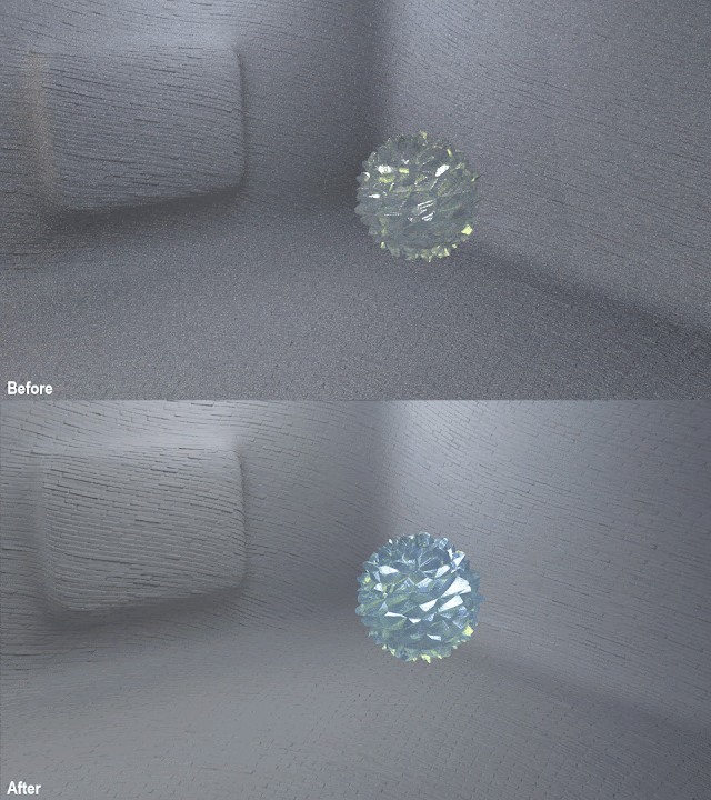
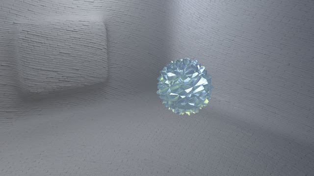
I also connected the position of one of the lights to the gem so I have better control over how the gem looks (hopefully this will look alright animated). I also clamped the AA samples and increased the low light threshold settings to try and restrict the render time as much as possible. I also wanted to tweak the colour of the gem slightly, so it was more greenish blue rather than the colour it originally was because it seemed a little dull to me. I wanted it to appear attractive but also unnatural. I'm quite happy with how the tweaked shot looks and I think it's now ready for final rendering later this week (the 'before' render is not what I sent to the test the render farm, I just wanted to do some more tweaking on it).
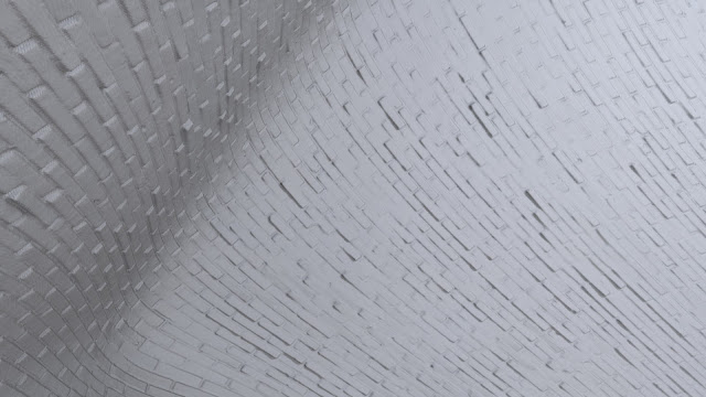
I also have a few shots of the room that are ready to render. It was suggested to me to just make a bunch of shots of the room and of the bricks, since the room is a very important 'character' in my film. I want to create a second pre-vis of my film as well, increasing the time the viewer spends looking at the room so I think it would be good to have a library of shots to use and re-use if I wish. One specific room shot that I think is ready is the shot I'm specifically using for When I think of perfection I see smoothness, since it mostly focuses on the animation of the bricks.
I noticed some odd lines in my bricks, which I think has to do with the displacement settings. I tried increasing the subdivision iterations but I noticed it did not like to render when I did that and some other errors cropped up that were more noticeable. I'm sure most people wouldn't notice it, I just do since I stare at the renders all the time. I suspect it'd be less noticeable as well once the camera is moving, motion blur is added, and other VFX. Like the gem, I spent time adjusting the samples to remove noise, delete unneeded lights, clamping samples, adjusting the low light threshold, and adjusting the lighting overall.


No comments:
Post a Comment