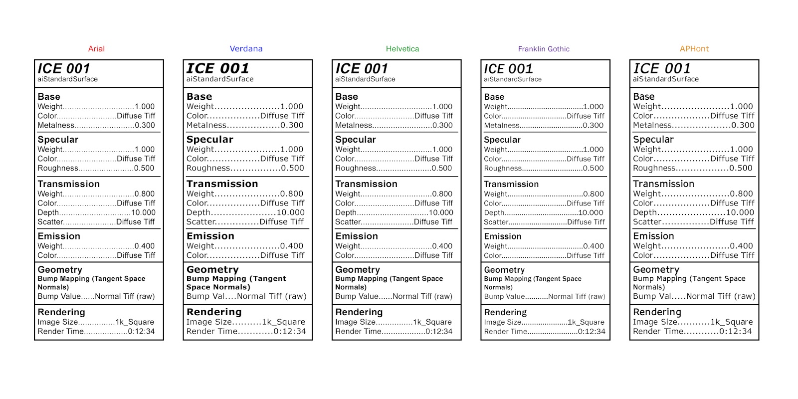
To further evoke a sense of 'hospitalisation' or some sort of institution, I was encouraged to explore ways of labelling my texturing experiments that will later on help me design my Art Of document. After some conversations, it became clear that it would be a good idea to explore the font and layout of medical prescriptions, pill packets/drug information tables, and nutritional information. It's odd because before I started actually looking at references, I didn't realise how similar medication labels and nutrition labels were which I think is interesting considering what my project is about.
I also researched a little online about which fonts are best for nutrition information and medication/drug information. Both of them recommend clear, easy to read fonts such as Arial, Helvetica, Franklin Gothic, and Verdana. I also found on this website that recommends using APHont as it is apparently easier to see for those who have weaker vision (I saw several other websites mention this font as well). I explored these fonts in the tests below, which were inspired by 'Drug Facts' (specifically the 'Active ingredients' section). I think out of all these fonts I prefer Helvetica, Arial, and APHont but I think I want to explore a few other fonts too. Some fonts were wider so for this test, some of the 'Bump Value' sections were shortened to 'Bump Val'...I'd change this in the final version but for this test I wanted everything to be the same dimensions. The render time in this is also made up for now.
I think this will be really interesting when paired with my texture tests. I need to figure out what backdrop/ground I want when rendering these images as well so I can keep it consistent throughout all the textures. I also plan to explore a few other layouts for these labels...for example, maybe including some bullet points or having it be more similar to a food label instead.
Showing posts with label Font. Show all posts
Thursday, 7 December 2017
Monday, 8 May 2017
Adaptation B: Correcting Light Errors & End Information Font Adjustments
As I was sorting out all of my footage, I noticed a few minor errors in a couple of my scenes. One of my scenes has to be rendered over again, which is my mistake. A few other problems I was able to fix in After Effects. In my opening scene, one of my models was linked up to the lights of a different model as well, causing it to illuminate too early. I corrected this by adding a black solid, creating a mask, and animating the shape and opacity so it didn't illuminate until the correct moment. I've also been trying to decide what font I want at the end, personally I find it easier to read longer pieces of text when they're not in all capitals but that could just be my poor eyesight. I have stills of the different options - the font I used in my playblast, the font that I used for all the other titles/credits in my animation, and that same font slanted.
Tuesday, 25 April 2017
Adaptation B: Font Tests
I wanted to try finding a font that would match the project for when I make an Art Of or anything else for this that would require text. I tried a few different things, such as using black on top of a slightly tinted, blurred version of the text. Most of them are hard to see, which is partially what I wanted... but they are way too hard to see I think - I prefer just the plain white text. I also tried both really simple font and more of a handwritten font (I was thinking sort of doctor's signature) and I definitely prefer the simpler fonts. I think I prefer #3 and #11 the most...choosing fonts is not my strength so any feedback would be appreciated.
Tuesday, 17 January 2017
Adaptation A: Testing Fonts II
After receiving some feedback I chose to look at some more extreme looking fonts. At the moment I prefer the first one (which was in the first 'Testing Fonts' post) and I like the bottom two fonts. I feel that the others are a little too extreme and possibly too unprofessional looking...sort of the equivalent of being too 'cutesy' only in a horror way but perhaps that is just my opinion.
Monday, 16 January 2017
Subscribe to:
Posts (Atom)


