I've also gotten my Art Of printed as a magazine using Issuu/Peecho. Via Moo.com I printed some business cards (with rounded corners to match my Art Of design) and some larger post cards since I enjoyed collecting the post cards when I went to New Designers previously. Overall I think/hope I'm prepared for next week and I'm excited to see what happens!
Showing posts with label Graphic Design. Show all posts
Friday, 29 June 2018
Pre-New Designers 2018
Here is my film (again) with the tweaked rotting and meat shots. This also includes the updated sound design for the 'bees' entity. I'm happy with how my film has turned out with these improvements and I'm excited to see if it sparks conversations at New Designers.
I've also gotten my Art Of printed as a magazine using Issuu/Peecho. Via Moo.com I printed some business cards (with rounded corners to match my Art Of design) and some larger post cards since I enjoyed collecting the post cards when I went to New Designers previously. Overall I think/hope I'm prepared for next week and I'm excited to see what happens!
Thursday, 7 December 2017
Minor Project: Initial Label Designs #1
To further evoke a sense of 'hospitalisation' or some sort of institution, I was encouraged to explore ways of labelling my texturing experiments that will later on help me design my Art Of document. After some conversations, it became clear that it would be a good idea to explore the font and layout of medical prescriptions, pill packets/drug information tables, and nutritional information. It's odd because before I started actually looking at references, I didn't realise how similar medication labels and nutrition labels were which I think is interesting considering what my project is about.
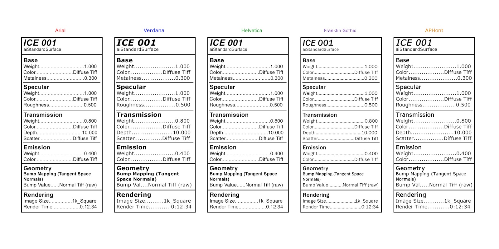
I also researched a little online about which fonts are best for nutrition information and medication/drug information. Both of them recommend clear, easy to read fonts such as Arial, Helvetica, Franklin Gothic, and Verdana. I also found on this website that recommends using APHont as it is apparently easier to see for those who have weaker vision (I saw several other websites mention this font as well). I explored these fonts in the tests below, which were inspired by 'Drug Facts' (specifically the 'Active ingredients' section). I think out of all these fonts I prefer Helvetica, Arial, and APHont but I think I want to explore a few other fonts too. Some fonts were wider so for this test, some of the 'Bump Value' sections were shortened to 'Bump Val'...I'd change this in the final version but for this test I wanted everything to be the same dimensions. The render time in this is also made up for now.
I think this will be really interesting when paired with my texture tests. I need to figure out what backdrop/ground I want when rendering these images as well so I can keep it consistent throughout all the textures. I also plan to explore a few other layouts for these labels...for example, maybe including some bullet points or having it be more similar to a food label instead.
I also researched a little online about which fonts are best for nutrition information and medication/drug information. Both of them recommend clear, easy to read fonts such as Arial, Helvetica, Franklin Gothic, and Verdana. I also found on this website that recommends using APHont as it is apparently easier to see for those who have weaker vision (I saw several other websites mention this font as well). I explored these fonts in the tests below, which were inspired by 'Drug Facts' (specifically the 'Active ingredients' section). I think out of all these fonts I prefer Helvetica, Arial, and APHont but I think I want to explore a few other fonts too. Some fonts were wider so for this test, some of the 'Bump Value' sections were shortened to 'Bump Val'...I'd change this in the final version but for this test I wanted everything to be the same dimensions. The render time in this is also made up for now.
I think this will be really interesting when paired with my texture tests. I need to figure out what backdrop/ground I want when rendering these images as well so I can keep it consistent throughout all the textures. I also plan to explore a few other layouts for these labels...for example, maybe including some bullet points or having it be more similar to a food label instead.
Minor Project: Ice 001-006 & Ceramics Glaze Test Influence
In these tests, I've actually applied my ice maps to the aiStandardSurface shader in Arnold rather than different shaders in Mental Ray. It was suggested to me to begin recording these texturing experiments in a more formal, organised manner...similar to glaze tests for ceramics. I like the idea of this because, despite saving all of the files anyway, it'll ensure I can recreate the materials as I'll have the settings all documented as well as exhibit the work that I've done that may not be seen otherwise.
![]() |
| Source |
![]() |
| Source |
The format below is just one way I may record my textures, I will most likely change the font. In Maya I used a Skydome Light and a Directional Light, a polygon plane with an aiStandardSurface shader (slightly reflective so I can see how any lights, reflections, and refractions look), and a polygon sphere which is what I am using to experiment on. I kept the camera locked in the same position and all the render settings the same. Perhaps I'll add this to the swatch description somewhere too so I know what samples and other settings I used, for now I'll have a separate image describing the settings I had (I realize that some of these values may be wrong/too high/irrelevant...this is just what I had at the time of rendering due to previous experiments).
On the swatches themselves, I included the main channels I used and I only wrote down what values I changed/what type of image I plugged in. I hope to figure out a similar layout I could use for the animation tests as well. I will most likely re-render these as well once I have a better idea of what setup I want...I also want to add the render times of each image since some of them took a lot longer to render than others.
I really like how this turned out using Arnold rather than Mental Ray and I prefer Ice 004 and Ice 006 the most. I felt I was able to get better results a lot easier in Arnold than Mental Ray in this case, despite struggling with it in the past so I hope that is a good sign. I may continue to experiment with this substance, and I think I want to try creating a height map to see if that will enhance it any further or produce interesting Displacement Map glitches (like in this test). I also plan to try and progress onto developing some other substances in Substance Designer such as a sponge. I also hope on experimenting with animating Displacement Maps and I have to see how that would work using just shaders (ex. the aiStandard Surface) and how that would change or distort a texture file like the ones I have been using for this ice material.
On the swatches themselves, I included the main channels I used and I only wrote down what values I changed/what type of image I plugged in. I hope to figure out a similar layout I could use for the animation tests as well. I will most likely re-render these as well once I have a better idea of what setup I want...I also want to add the render times of each image since some of them took a lot longer to render than others.
I really like how this turned out using Arnold rather than Mental Ray and I prefer Ice 004 and Ice 006 the most. I felt I was able to get better results a lot easier in Arnold than Mental Ray in this case, despite struggling with it in the past so I hope that is a good sign. I may continue to experiment with this substance, and I think I want to try creating a height map to see if that will enhance it any further or produce interesting Displacement Map glitches (like in this test). I also plan to try and progress onto developing some other substances in Substance Designer such as a sponge. I also hope on experimenting with animating Displacement Maps and I have to see how that would work using just shaders (ex. the aiStandard Surface) and how that would change or distort a texture file like the ones I have been using for this ice material.
![]() |
| Ice 004 |
![]() |
| Ice 006 |
Monday, 8 May 2017
Adaptation B: Correcting Light Errors & End Information Font Adjustments
As I was sorting out all of my footage, I noticed a few minor errors in a couple of my scenes. One of my scenes has to be rendered over again, which is my mistake. A few other problems I was able to fix in After Effects. In my opening scene, one of my models was linked up to the lights of a different model as well, causing it to illuminate too early. I corrected this by adding a black solid, creating a mask, and animating the shape and opacity so it didn't illuminate until the correct moment. I've also been trying to decide what font I want at the end, personally I find it easier to read longer pieces of text when they're not in all capitals but that could just be my poor eyesight. I have stills of the different options - the font I used in my playblast, the font that I used for all the other titles/credits in my animation, and that same font slanted.
Tuesday, 25 April 2017
Adaptation B: Font Tests
I wanted to try finding a font that would match the project for when I make an Art Of or anything else for this that would require text. I tried a few different things, such as using black on top of a slightly tinted, blurred version of the text. Most of them are hard to see, which is partially what I wanted... but they are way too hard to see I think - I prefer just the plain white text. I also tried both really simple font and more of a handwritten font (I was thinking sort of doctor's signature) and I definitely prefer the simpler fonts. I think I prefer #3 and #11 the most...choosing fonts is not my strength so any feedback would be appreciated.
Friday, 10 February 2017
Adaptation A: Submission Post - How To Build A DIY Frankenstein Monster
Reflective Statement:
Going into this project I was quite nervous about it since graphic design and animation are not necessarily my strengths. However, I wanted to do my best and use this project to hopefully improve on these sets of skills that I often put on the back burner. Overall I'm happy with what I have been able to make, despite my nervousness and lack of confidence at the start. I feel I was lucky because I had used After Effects to create VFX for past projects including 'Leviathan', 'Pikatti', and animating my 'Denoria' digital set. I'm happy I was able to learn more about After Effects because I realised early on how useful it can be especially when it comes to cutting down render time in Autodesk Maya by creating VFX in After Effects instead. I feel I could have possibly added more to the sound design, but I didn't want to overdo it due to the 'silent film' aesthetic I was going for. I had a few moments I was very frustrated with my music because I had to spend a lot of time desperately trying to loop it so it could last the whole length of the animation. In terms of design, wish I could have spent more time designing some of my assets, especially the monster. While I feel that the black and white works well for this project because I was influenced by Frankenstein (1931) and Young Frankenstein (1974), part of me wishes I experimented more with colour just to see what it'd look like. Lastly, I'm happy with how the animations came out and I think I was able to blend animation from the Plug-In 'Animation Composer' with my own keyframes and special effects effectively. However, there are parts of the animation that I wish I had more time to figure out, such as maybe having the needle actually weave in and out of the monster's skin as the head gets stitched on. Despite these things, I'm happy with the result and I'm hoping I continue to improve my graphic design skills in the future.
Labels:
2D Animation,
Adaptation,
Adaptation A,
Adobe Audition,
Adobe Premiere,
After Effects,
animation,
compositing,
Final,
Graphic Design,
Infographic,
Reflective Statement,
Submission,
VFX,
Year Two
Tuesday, 17 January 2017
Adaptation A: Testing Fonts II
After receiving some feedback I chose to look at some more extreme looking fonts. At the moment I prefer the first one (which was in the first 'Testing Fonts' post) and I like the bottom two fonts. I feel that the others are a little too extreme and possibly too unprofessional looking...sort of the equivalent of being too 'cutesy' only in a horror way but perhaps that is just my opinion.
Monday, 16 January 2017
Subscribe to:
Posts (Atom)