
Wednesday, 18 November 2015
@Phil - Composition Tweaking
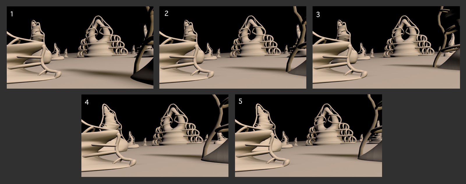
I moved around that building that was in the foreground on the right so you could see the rings better to make it more interesting and less like a random pipe/blob on the side...think any of these work better? I'm also unsure if the building on the right that's in the distance does anything or if it just looks like a random mass far in the distance...in my opinion it could do not being here but I don't want to make the image look flat.

Subscribe to:
Post Comments (Atom)
Hey Dee, I think 3 is working better in terms of the element on the right. It looks more purposeful now in terms of the composition. I think you need to look now at the elements on the left. If you look, you'll see that the jutting point of the element in the immediate foreground aligns perfectly with the outer profile of the mid-ground element behind it. This is encouraging us to read this collection of elements as visually co-joined and it's not helping lead our eye further into the picture plane. Have a fiddle with that arrangement - and yes, maybe get rid of the other building element that we can see through the hoops of the right-hand element. Onwards! :)
ReplyDelete